Welcome to another campaign-based income report here on Smart Passive Income. This month, we’re going to examine a promotion I ran at the end of last year for Cyber Monday to promote my online courses.
I’ve run small promotions during Cyber Monday before, but only for my architectural-related business.
Why not anywhere else? Because I had no other products of my own to sell!
Up until 2017, affiliate marketing had accounted for about 90 percent of my income, with podcast sponsorships, books, speaking, and niche sites making up the rest. Then, I finally created my own courses to better serve my audience, and have seen a significant increase in income ever since.
There were a lot of lessons learned and many things that could have been improved upon during this promotion, but I’m most excited about the results behind a brand-new tool my team and I discovered that makes selling a lot easier, and will forever change how I approach sales and marketing in the future.
I’m going to share all of that here in this post with you, including income generated during the promotion, and by the end, hopefully you’ll be better equipped with the knowledge, and tools, for your upcoming promotion, too.
SPI-ber Monday
For Cyber Monday (which my team and I decided to call SPI-ber Monday), I wanted to promote all of my online courses to finish off the year. This promotion would last 48 hours, and all of my online courses would be sold for 30 percent off.
I have three courses available that would be featured in this promotion:
- Smart from Scratch: Designed to help you pick a niche and discover a winning business idea and lead you to your first sale.
- Normal Price: $249
- Sale Price: $147.30
- Power-Up Podcasting: My most popular course built to help anyone not just start a podcast, but launch it effectively with marketing strategies to help you get the most listeners possible, even on day one.
- Normal Price: $799
- Sale Price: $559.30
- 1•2•3 Affiliate Marketing: A step-by-step program to walk you through the best affiliate marketing strategies to make money by recommending products other than your own.
- Normal Price: $699
- Sale Price: $489.30
In addition, we wanted to pre-sell and validate a brand new course—an upcoming advanced podcasting course (for existing podcasters only) called AMP’d-Up Podcasting. It was already outlined in heavy detail, but not yet created.
(AMP’d-Up Podcasting will be available to the public in March 2019.)
As my team and I were discussing how to market all of these courses at the same time during a 48-hour sale period, it quickly became apparent that it could become very confusing (and potentially overwhelming) with all of the different products that were being offered at the same time.
Too many options often means too little action.
That, combined with the fact that everyone else who had a product to sell would be actively engaging their audiences, too. It was going to be a challenge, for sure.
Consolidation and segmentation during this promotion was key.
Teachable, the online course platform that I use and love (also, in full disclosure, I am an advisor and an affiliate for Teachable) puts all of the courses together on a “school page,” but that’s more like a library with hardly any room to put any special promotional copy or deals. Furthermore, I have free courses (such as Build Your Own Brand) that I did not want to have shown on the same page.
Although each course has their own separate sales page, I wanted to build a central hub—a single landing page—for all of the courses and the SPI-ber Monday launch.
This hub would include a few key elements:
- A customized video at the top of the page to get people excited about the limited-time offers that were available. I was not course specific (you’ll see why in a minute), but I was very clear on when the promotion was over, mentioning the date and time specifically.
- A countdown timer at the bottom of the page, thanks to a tool called Deadline Funnel.
- A mini-sales section for each course with compelling copy and a clearly marked discount off the regular price point.
- Testimonials for each product next to the buy button.
- A buy button for each course that goes directly to check-out (versus the individual, longer-form sales pages)
- A Facebook pixel so we could retarget people who have visited the page.
Pages like this should have no other navigation, buttons, or calls to action other than the products that you are offering. This is the drawback of simply creating a new page in WordPress, which usually still includes all of the navigation and sidebar options.
My team and I love using LeadPages to build pages like this. The builder makes it drag-and-drop easy to create, and although the page is not hosted on Smart Passive Income (it’s hosted on LeadPages’ server), that actually doesn’t matter so much. [Full Disclosure: I am a compensated affiliate and advisor for LeadPages.]
After building the page, LeadPages gives us a link, which becomes exactly where we want to drive all traffic to. We can also include a Facebook pixel on that LeadPage.
Here’s a sample section of the page for you, showing just how much copy we used, and how we tailored the call-to-action:
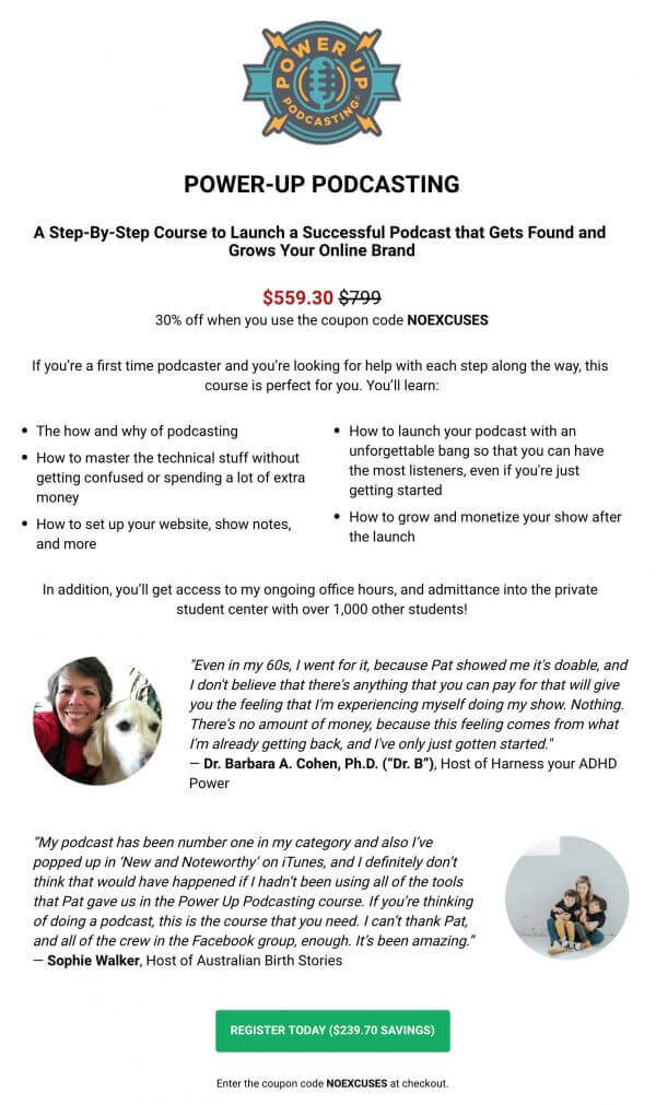
A few important things to note here:
- You’ll notice a strikethrough of the normal price, followed by the sale price. You can’t get more clear about the savings here. I tested this back when GreenExamAcademy.com first started selling products, and it works like a charm.
- The content section is split into two columns to allow for more bullets in less space. Again, this can be done simply in the LeadPages builder.
- Proof, both in the form of the numbers of students served, and of course, the testimonials from a couple of my students.
- The CTA button color stands out on the page and also includes the savings right on it.
- There’s a coupon code.
The idea behind the coupon code, which was mentioned at the top and bottom of each section, was to allow for customers to actually see their savings come through off the regular price, as opposed to automatically applying the sales price during checkout. That experience—the act of entering the coupon code and seeing the savings being applied—would, in theory, convince more people to actually follow through.
This doesn’t always work, but for a promotional period that has a clear start and end date, I believe personally that it’s more likely to work.
Does it actually make a huge difference?
There are so many variables in every single person’s promotional style and products, the best answer is to test it for yourself.
But There’s Still That Problem
The central page is setup, all of the buttons go to where they need to go, but we still have a problem:
There are too many products for sale on a single page.
I’m not an Amazon or ecommerce store where browsing for multiple products on a single page is the normal buying behavior. For online marketers, especially if you’re building audiences and serving them with quality products, you want to be more direct when possible:
“Have this specific problem? Here’s this specific solution.”
Understanding who is in your audience and segmenting them based on the problems they might have and the language they specifically use is a significant advantage. I’d recommend listening to Ryan Levesque, author of Ask, in Session #178 of the Smart Passive Income Podcast for more info about audience segmentation and exactly how to do it.
Over the years, I’ve been able to use my email service provider, ConvertKit, to not only collect emails, but start to place my subscribers into different buckets depending on where they are on the entrepreneurial journey. An example of how I do using in-email surveys can be found here in this video. [Full Disclosure: I am a compensated affiliate and advisor for ConvertKit.]
But even after segmenting my audience and understanding who needs what on my email list, how can I give access to only what they need, and nothing more?
What about my existing students? It’s a poor practice to offer the same course to someone who has already purchased it.
Sending different groups of people to different sales pages makes sense, but that’s a huge overhaul of three to four separate pages in a very short period of time, only to then revert back to what they were before the sale.
There’s got to be a way to organize this!
(You can probably sense there’s a solution coming . . . hehe.)
Enter, RightMessage. My 2019 pick for new conversion tool of the year.
Note: My team and I tested this tool for over six months to make sure this was the best for us and the SPI audience who wants to level up their conversions. As a result, I’m proudly an affiliate for this tool, and have struck a deal with the company to offer you an extended free trial (from 14 days, to 30), which is only available through my link.
To best explain how RightMessage works (before I share how my team and I utilized its superpowers, and the results), let’s create a hypothetical, but simple example.
Let’s pretend you own a website and business that helps people learn how to paint. While you share a lot of tips to help the first-time artist, you also share a lot of tips and strategies for helping existing artists sell their artwork.
You basically have two groups of people who follow your work:
- Bucket 1: Beginner artists (who have no business selling their artwork yet); and
- Bucket 2: Artists who are ready to sell their artwork online.
Through your email list, you begin to tag and segment your audience based on which bucket they fall into. Furthermore, using RightMessage’s built-in tool, RightAsk, you begin to create surveys that show up cleanly on your website that ask which bucket they fall into and categorizes that person (even if they are not on your list).
And with that information, and the power of RightMessage, magic happens . . .
Every time a Bucket 1 (beginner artist) comes back to your homepage, they see messages such as:
- Develop the skills you need to become a successful artist!
- Painting isn’t hard, it just takes some time. Let me cut the time in half for you.
- Want to start painting? You’re in the right place. Grab your first lesson here.
And on the SAME homepage (not a second homepage that you create), Bucket 2 (pro artists) will see this kind of messaging:
- You make great art. Now it’s time to make great money.
- Your artwork could be worth a lot. Let me show you how much.
- The best strategies for monetizing your art and talent.
For each, you could have different images, too:
- Bucket 1 could include images of rough sketches and something not entirely intimidating.
- Bucket 2 could include artwork at an auction, or hanging with a price tag next to it.
When you know your customers and can speak their language, you’re more likely to capture their attention, more likely to hold their attention, and more likely to convert them into a customer.
On Smart Passive Income, starting in July 2018, I begun using RightAsk to show a survey at the bottom right-hand corner of my website to begin collecting data, which you might have seen on a previous visit here on the blog. It looks like this:
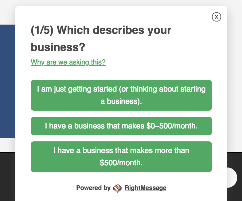
I ask five questions in total, and currently we have an amazing completion rate that helps me better understand my audience. Here’s a sample of the data we receive from RightMessage:
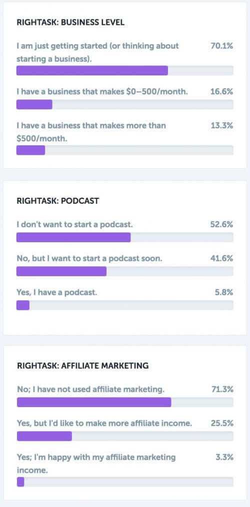
Through RightAsk, over 60,000 questions have been answered!
Not only is SPI collecting real-time survey results from the audience, but that data is held onto that specific person in RightMessage via IP address, and then email address after they subscribe. How huge is that!?
That means that I can have any page on the website show different messages to people depending on what I know about them.
See where I’m going with all this?
Let’s show you an easy example using the SPI homepage.
I have three buckets in my audience that I segment for:
- Bucket 1: People who are interested, but have yet to start an online business.
- Bucket 2: People who have started an online business, but only make $0-500/month
- Bucket 3: People who are making more than $500/month
Each bucket has different needs, solutions, and unique language that they use.
Using RightMessage’s visual editor (because hardly any coding knowledge is needed to make these personalizations happen), here’s what the homepage of SPI looks like when a person is in Bucket 1:
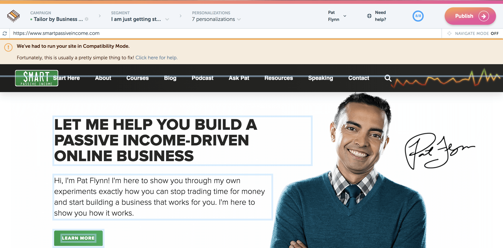
Notice the subtle different in the headline here for Bucket 2:
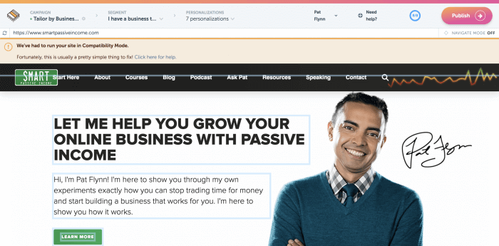
And Bucket 3, the more advanced segment of my audience:
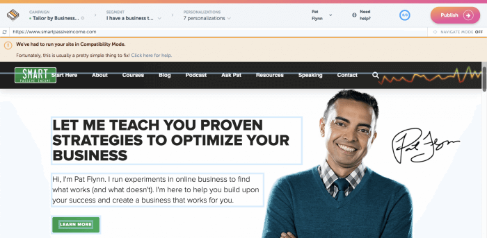
Now that I look at this again, I should probably create more personalized subtext under the headline, which would only take a few seconds.
The copy on your homepage is the easiest thing to personalize first. That’s where I would start. Then, you can go even further with it if you’d like, which takes us back to our landing page for SPI-ber on LeadPages, which yes, also integrates with RightMessage.
Yes, you can personalize any custom LeadPages you build, too.
Can you see why I love this thing!?
Making Magic Happen
Using the data collected from RightMessage, AND the integration with my email service provider, ConvertKit (meaning, RightMessage can serve people different messages on my website based on what tags they have in my email service provider), I can have the same sales page promotion only show what courses and messages I want to show.
I’m not going to get too specific with the campaign details here because we did have eight to ten different variations based on what bucket they are in, whether they have a podcast already or not, whether they were a student already or not—those kinds of things—but here’s the gist of what we wanted to make sure happened:
Beginners will not see messages for my advanced courses, and their primary course offering would be my beginner course, Smart from Scratch.
Existing students will not see the sections that promote the same courses they are already in.
Existing podcasters will clearly see the promotion for Amp’d Up Podcasting up top.
To the best of our ability, language should be personalized for each particular group.
It’s like magic, when in reality, it’s just RightMessage.
So How Did the Campaign Perform?
As a result of the campaign (and this was after a lot of data crunching and even chats with the RightMessage team), during the SPI-ber Monday sale, we were able to increase revenue by $104,000 by dynamically tailoring the offers based on customer status tags we had stored in ConvertKit and RightMessage.
We discovered, through A/B testing against a control (which was the standard sales page) that Right Message helped us increase conversions by 2.38x. That means without it, we would have generated only $75,900 on our own.
HOME RUN!
That’s a huge increase in income due to personalization. On one hand, I know I’ve built a ton of trust with my audience and would have likely done very well without the tool, but the numbers are that much higher that, even if the numbers aren’t exactly correct here in the reporting, you can’t deny that this is helping out, big time! Right Message is a huge discovery and I can’t wait to see how it impacts the results of my business moving forward!
And furthermore, I was happy to have several new beta students (over 50!) join my new course, AMP’d Up Podcasting, taking advantage of the pre-sale that happened during the campaign!
And interestingly, the best-selling course as far as quantity was Smart from Scratch, which tailored to the beginners in my audience which, as you saw in the survey data from above, makes up a majority of my audience.
Lessons Learned
Three big lessons learned.
First, although we used RightMessage to personalize offers and better convert several customers, having a pre-sale for a new course in the mix definitely is something I wouldn’t do ever again.
A pre-sale for a course is a big deal, and any and all messaging during a pre-sale period for the validation of a course should be about that course, and that course alone. To mix that along with the other courses that were available was a big mistake, and I think it reduced the overall conversion rates on both sides of the equation.
In the future, a pre-sale or beta launch should be treated more like its own event. It’s a big deal, and you shouldn’t lessen that by having other offers potentially confuse the buy, or overwhelm them.
I made a mistake in the video on the sales page too, referencing AMP’d Up Podcasting, even though for some we had removed that from the page. I’m sure several subscribers in Bucket 1 must have been confused. The video, however, did have a 100 percent play rate, which takes me to my second lesson . . .
Although I had made that mistake with the video, we did experiment with auto-playing the video once a person landed on the page. A couple of years ago, I would have been 100 percent against this. Auto-play = bad.
But, auto-playing videos is more common nowadays, especially on social media. Scroll through your feed on Instagram or Facebook (and even YouTube now), and you’ll see videos play automatically.
But what’s the one thing all of those social media sites have in common with the videos they auto-play? The sound is off, and usually there are subtitles.
So, that’s exactly what we did.
Using Wistia as our video host, we set the videos to auto-play with the sound off, and we included subtitles so even if a person was watching with the sounds off, they could either keep reading, or simply click the video to have the sound come on.
I’ll likely continue to use this strategy on custom sales pages moving forward.
And finally, the third and biggest lesson was from RightMessage. The lesson? It’s one of the best tools I’ve found in a while that has had a dramatic effect on my business. Not just in sales here in this particular promotion, but also for generating more email subscribers, and keeping people on my page longer.
By connecting with people based on where they are at, a little bit of on-site personalization can go a very long way.
If you’d like to explore RightMessage, I’m good friends with the founder, Brennan Dunn. I asked him, knowing I was going to share this tool today, if there was a special deal that he could offer the readers here, and he did not disappoint.
If you click through my affiliate link here, or anywhere else on the page, you’ll be given access to a 30-day free trial, which is more than double the normal 14-day trial you normally get access to. That’s only available here, so I hope you give RightMessage a shot. It’s simple to setup, and once you get a feel for it, it can become a powerful weapon in your arsenal of tools to better serve your audience, and ultimately, make more money.
Cheers, and I hope you enjoyed the Income Report this month! Look out for next month’s where I’ll take you behind the scenes of one of my content platforms, and just how much money is being made there, and how.


