Note: While the specific button style mentioned in this post may be dated, the concept of split-testing key elements of your sales process is as relevant as ever. (Editor’s Note 09/2015)
A very wise person once said, “assume nothing, test everything.” This is what Ryan Deiss of drivetraffic.com did, as he created 43 different “split-tests” and came up with the best ways to optimize all different parts of a website for monetization.
In business terms, a split-test is defined as a “Direct-marketing test utilizing random samples drawn from a single list.” Ehh, that makes sense, I guess, but here is my definition of split testing online:
Creating multiple variations of a single webpage, where each variation of that single webpage has but one difference, to show which variation(s) convert better.
For example, let’s say you have a sales page for your product. When running a split-test, you create two of the same sales page, but each will have one piece that is different (i.e. different background colors, a different page title, etc.), while everything else stays the same. You can actually split the number of visitors to your website equally and randomly between the two sales pages (hence, “split” test). You then can see which one produces more product sales. You might think that something like a background color of a webpage has nothing to do with the sales of a product, but it’s been proven that certain colors do make a difference in sales. There are a ton of these little tweaks that can drastically increase the outcome of your website and sales pages, one of which I learned a few weeks ago.
Ryan was kind enough to share one of his tactics for free, which he titled, “The ‘Magic’ Buy Button that Doubles Sales.” I implemented his tactic on my own sales page, and have some fun results to share. You can watch the video about it on his website, but I’ll go over basically what he tested.
The Magic Buy Button
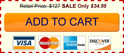
Have you ever seen a “Buy It Now” button? Of course you have. This is exactly what Ryan was testing. He tested the color, size, shape, and text and how all of those split tests made an impact on his sales. Ultimately, he came up with “The Best” button to use, and that is a button that looks like this:

Doesn’t that make you just want to click it? Ryan concluded the following things:
- The bigger, fatter button was better than the smaller versions.
- This particular orange color, on the lighter background was optimal for clicks.
- Placing the text “Add to Cart” instead of “Buy It Now” also increased earnings.
- Having the credit card logos beneath the button gave customers a sense of assurance and protection, which made more sales go through as well.
- Also notice the text at the top, with a strikethrough retail price and a sale price next to it.
This kind of stuff amazes me, especially how easy all of it really is. The internet is such an amazing place. There would be no way to do any of this type of marketing research in an offline company, unless we had millions of dollars (like how KFC spends millions on determining which of their sauces to use in their latest chicken sandwich, using focus groups and a lot of time).
Was the “Magic Button” Really a “Magic Button”?
Before trying out this button, I was averaging about 10-12 ebook sales a day on my website at intheleed.com using this button:

I thought I was cool because I had an arrow pointing to it. Let me just tell you, Ryan is much cooler than I am.
I placed the “magic” button on my sales page on November 28th, which was the day I saw that video from Ryan. Yes, I was very eager to test it out. My results?
Since then, I’ve been averaging about 13-17 books a day. I honestly did not change a whole lot of other things on that page besides the look of the button.
I increased my earnings, just by implementing the “magic” button. Absolutely amazing.
How Can This Help You?
If you sell anything online on your website, especially if it’s on a one-page sales page, use the button! It really only takes less than 5 minutes to implement. Of course, you’d have to change the prices to suit your particular product, which can be easily done with photoshop.
If you don’t have a product just yet, you should definitely keep this in mind for the future. Also, in my next post I’ll be going over how I’m using Google Optimizer to run my own split-test on my sales page, and how you can easily do this too. You can do things like decrease bounce rates, and increase user action using these same techniques.
I hope you enjoyed this post. All the best to you.


