A lot of people ask me the following question:
“Pat, if you had to do it all over again, what would you do differently, and why?”
I have three answers for you:
- Start Sooner: If I had known what the possibilities were, I would have gotten into online business much, much sooner. I’m very fortunate I was laid off back in 2008 because it was my lay off that took my eyes off of “the right path” and put me on the path that was right for me. If I had known, I would have taken the bold actions necessary (bold actions that my lay off forced me to take) to make something awesome happen and get something out for the world to see, read and consume much sooner via the Internet.
- Build an Email List Right From the Start: One of the biggest mistakes I’ve made since being in this business was not building an email list right from the start. I waited over a year to finally put an opt-in form on my blog and I missed out on huge opportunities to connect with my audience and engage with them in ways that no blog post, video or podcast can ever do. If you still have yet to build an email list, I’ve laid out all of the steps for you in my Beginner’s Guide to Starting a Newsletter.
- Include a Starting Point: I’ve lost potential readers and life-long fans of the SPI brand simply because I don’t have a good starting point on my blog. This is what today’s post is all about—creating a starting point.
Why Is a Starting Point Important?
A starting point is a page on a website that gives new readers clear direction and it’s totally underutilized in the blogosphere.
Why is this important?
Because blogs are a huge mess.
There is hardly any order to the posts that are published and although there is the occasional 2-part, 3-part or n-part series that keeps a few posts in order, they are simply a group of ordered posts in an unordered web of chaos.
Additionally, a lot of our best content—content that would be perfect for anyone new to the site (or new to the topic of our site), was probably written during the first few months of the blog’s life when there were hardly any readers. A starting point is a great place to bring those old posts back into light.
To us, the blog owners, our blogs make total sense. We’re so involved with our blogs and we know exactly what’s going on, but to the reader, and especially the new reader, it’s like trying to read a book that was written on loose-leaf paper, un-numbered and thrown into the air and having the pages randomly land on the ground.
How does a person other than you know where to begin?
Our job as blog owners is to make things as easy as possible for our readers:
- We make sure navigation around our site is seamless.
- We use things like cache and CDN systems to decrease page load time.
- We keep fonts clean and our posts structured for easy readability.
- We make sure any call to actions require the least amount of steps as possible.
We know this stuff, but most of us overlook the one thing any brand new visitor could definitely use—a clear starting point.
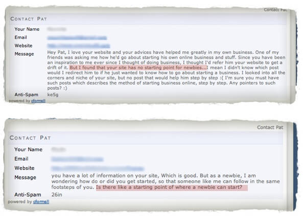
Here’s some proof:

These are just 2 of several emails from new visitors who had no idea what to do when they landed on my site. So as you can see, this blog definitely needs a starting point, which is why I’m sharing my thought process with you today as I plan to set one up very soon.
About Page vs. A Starting Point
An “About Page,” a page on a blog that tells a reader what a blog is about and a little bit about the author, is not a starting point.
Well, let me rephrase that—an about page is not a good starting point.
An about page is important—don’t get me wrong. It’s been covered extensively by several pro-bloggers and is considered to be one of the most important pages on any blog, however, there’s a huge difference between an about page and a starting point:
An about page is viewed when people want to learn about a website and its author, and a starting point is viewed when people want clear direction on what actions to take and what steps are involved.
I’d recommend having both pages, and at the end of your about page link to your “start here” page for anybody who reads your bio and is ready to take action.
The Components of an Effective Starting Page
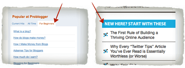
I only know a couple of bloggers who specifically have a place for beginners on their homepage: Darren Rowse from Problogger and Corbett Barr from Think Traffic. There may be more, but these are the two that I remember. (Editor’s Note 9/27/18: Think Traffic has since changed its name to Fizzle.)

These are great examples, but I feel that I could take this idea a step further and create a specific page here on SPI that would allow me to address beginners in a voice and tone that is perfect for them, while being able to easily link to any posts and embed any videos that I feel are relevant and appropriate for someone new to the topic of passive income and building an online business.
People want guidance, and again it’s our job is to make things as easy as possible for our readers.
Before I create my starting page (which I would link to on my homepage—above the fold), I’d like to go over what I might include and why:
1. A Short Introductory Video
I’d like to include a brief welcome video that introduces who I am, the page and what kind of content can be found on it. I want to utilize my green screen setup for the video because first impressions are huge and a memorable first impression can lead to long-term readers, fans and followers.
2. Quick Definitions
How are people supposed to what to know what to do when they have no idea what you’re talking about? By quickly defining a few key terms (in my case, it would be the definition of passive income) people will sort of get an idea of what’s going on.
3. Links to My 3-Part “Types of Passive Income” Podcast Series
Over the past month I’ve recorded about 3 hours of content for my podcast that is perfect for the beginner (part 1 can be found here). I did this on purpose because I wanted to include some type of audio on my starting page that people could listen to—especially while on the go.
Imagine people who have just landed on my site spending almost 3 hours with me in their car, at the gym—whereever. You can be sure those people who get fired up about that content will come back to my site for more.
4. “Your First Steps…”
I’d like to include some clear instruction on what people should do first. Since I have so many different income streams and methods people could choose from, I might include a few quick guides on how to get started with each. Luckily, most of this information has already been recorded or written about on my blog, so it’s as easy as linking to existing blog posts or videos that are buried deep in my archives.
5. Links to My Most Popular Posts
I think this is a perfect opportunity to showcase some of my best content. Not only will this be helpful for the reader, but it will also support the fact that I have some authority in this niche because most of those posts have several hundred comments.
Essentially, I’m adding social proof here.
6. Instructions on How to Contact me
I think it’s really important to also include an easy way to contact me if any questions or concerns arise. I want to make my new readers feel like they have a resource and a friend that is here to help if needed, one they couldn’t find anywhere else. Sure—that’s opening up the door for some potential emails, but it’s also opening the door for clientele and future customers and hardcore fans.
Invest time now. Reap benefits later.
7. An Easy Way to Share the Page
This page will be public and I want as many eyes to see it as possible. By including an easy to click Facebook Like button and a Retweet button, I could potentially reach new audiences that I would never have been able to reach otherwise, especially when you consider that it is new visitors who are looking at this page—new visitors who are connected to entirely new networks of people.
8. An Opt-In Form for my Newsletter
This is a given.
At the bottom of the page, I’d have a clear call to action to subscribe to my newsletter. This is a perfect opportunity to offer even more content, such as a free download, to hopefully make an even bigger first impression and get them to take even more action.
Also, just the act of giving away an email address does something psycologically to make any future actions much more acceptable.
Am I Missing Anything?
The reason I’m posting about this before I go live with my starting point page is because really it’s for you. I wanted to ask you if you feel a page like this would be good for a beginner or newbie and if there’s anything I should add that I’m totally missing.
I hope that after reading this you can see the hole that needs to be filled on most of our blogs and what we can do to fill it.
Cheers!

 Daniel Scocco

