This is a guest post by Luke Guy, the final guest post in the series of guests posts that were scheduled here for the month of March due to speaking and travel engagements.
Mid-last year, Google updated the Gmail interface to include “tabs,” which separate incoming emails into specific categories. There’s the primary tab, the social tab, and the promotions tab (not including custom ones you might create yourself). Even if you don’t use Gmail as your email client, this is important because a significant portion of your audience probably does.
If you send emails to your email list, you might not even know that your emails are filtering into your readers’ promotional tab, which in most cases never get checked. Many people have seen a significant decrease in email open rate, which is directly related to this change in Google.
Along those lines, I’ve always debated with myself whether or not to use graphics (like headers) in the emails I send out. As you might know, if you’re on my list, I just keep it simple with text only.
I enjoy using text only because I like to make my emails feel like they’re from a friend, but Luke discovered an interesting byproduct of the way I structure my emails. Here’s Luke to explain more:
I was going through my Gmail account the other day when I noticed some messages had never reached me. Messages that I looked forward to. I love my Gmail and check it many times a day; more than I do my social networks.
Why?
I don’t trust just anyone with my email address. You’ve got to be special. Everything I receive in email is nothing but serious business, like laser-to-the-point serious. When I hear a that email “ding,” it better be good.
Back to the point. . .
My favorite messages, from people I loved hearing from, wasn’t making it to my Gmail.
To be specific, people like Michael Hyatt and Amy Porterfield.
Did these people just drop off the planet? Did they quit blogging?
I search the other tabs and you won’t believe where I found them. . . in the Promotions section!
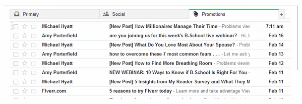
Why is this a big deal?
These guys are important to me and I love reading their stuff. Michael Hyatt was my inspiration when it came to blogging. He’s actually the one who inspired me to start Lukeguy.com. Amy Porterfield was the Facebook Genius who helped me grow my Facebook Fanpage. I needed them both and I knew they had been gone for a while.
It’s amazing how far two tabs over can be.
I hardly ever check these tabs, and I’ll bet that most people don’t either.
Back to the point.
These bloggers, who make six figures doing what they do, are getting caught in tabs where spammers belong. That’s a scary thing, because eventually people are going to move on, and just not care about their latest post. Gmail is the main email provider these days and I know this is hurting their email open rates.
Why is Google separating us from people we have subscribed to?
It’s called the Google Algorithm, and it thinks it’s your online nanny.
This “nanny” is actually a filter system and it goes through all your emails. It’s organizing them, putting them in other places so your “Primary” section isn’t flooded with emails you don’t care about.
People are just now realizing this is even happening as their open count is declining by major numbers. How these major bloggers haven’t noticed I have no idea, maybe they have just accepted the fact of lower numbers. Not sure, but they don’t have to, and here’s the common “solution” to get back into the Primary Section (in Gmail) of your readers.
Solution by others
Email your subscribers telling them to drag your emails over to primary.
My problem with this is that they may not see the email telling them to do this, because that was the point of the email to begin with. Second, people find this inconvenient, tiresome, and it’s not even a guarantee. I did this to Michael Hyatt’s email and the next one ended up back in the “Promotions” section anyway. So, go figure. This may or may not work for you.
Here comes the REAL solution.
I have another blogger that I love reading from. His name?
Pat Flynn.
He’s been featured in a lot of major places and he’s really good at helping people with passive income. But what really makes this guy stand out is his email formatting. Everyone of them is making it to my “Primary” section in Gmail.
Very strategic and many people haven’t caught on, including other major bloggers as you saw above. To get a closer view of Pat’s and other successful emails, click here: Examples Of Viral Newsletters Released.
His emails are short, packed with tips, and content that should be found in a major blog somewhere. I have yet to find Pat trying to sell anything through email like most do. Which I’m sure he does, it’s just so rare. Links aren’t everywhere in these post and he’s straight to the point. He doesn’t write me on the weekends and it’s like he knows when I’m available. Smart guy, almost like my best friend.
Want to know what makes his emails unique?
100 Emails Challenge

Build your email list now with our three-day challenge
Three days, three emails, and one download, all packed with step-by-step instructions to walk you through the process of taking your email list from zero subscribers to 100+.
Free newsletter. Unsubscribe anytime.
Here are the secret ingredients:
- Have no more than one link in your email.
- Include no pictures.
- Mention the reader’s name using Merge Tag Tricks with ConvertKit, MailChimp or Aweber.
- Turn off the RSS Campaign. If you want a higher open count, you must type these emails out by hand.
- Write to the reader like they are your friend.
- Don’t go spammy like this: Hey!!! WANT TO MAKE MONEY FAST??!?!?!
- Write in Traditional Letter Form.
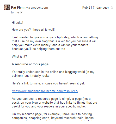
Here’s an example of one of Pat’s emails:
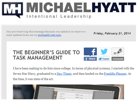
Here’s one of Michael’s:
And Amy’s:
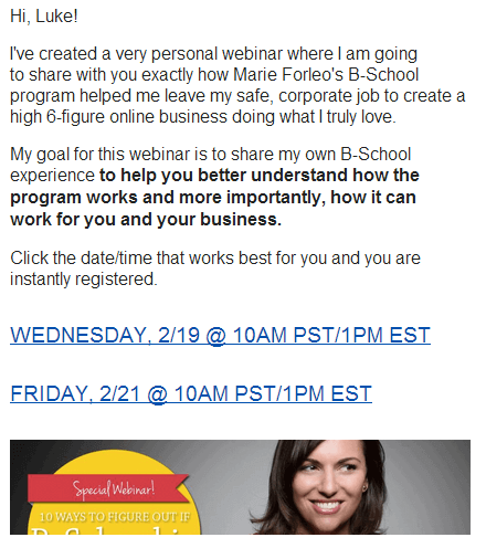
Google seems to be measuring the tone these guys are writing in based on links, phrases, and picture count. It also can tell if it’s an RSS feed shot out by an email service.
What emails are the most fashionable?
Well Michael’s and Amy’s of course! But which one made the touchdown?
Pat’s.
When it comes to email, fashion is a bad thing.
I love all of these folks and they share some very helpful information. Michael is who got me into blogging and Amy is who got me into Facebook advertising. All very good information provided by these folks. Just wanted to show how easy it is to trigger Google into placing your emails into other tabs; tabs that are hardly ever clicked on.
For spammers that’s okay, but not these guys. Hopefully they’ll change their format, because I love their stuff and want to see it in my primary.
So let this be a lesson, and use these strategies to stay out of the “no man’s land”.
So is all this really worth it?
Also, I’m curious, which kind of email do YOU prefer? Do you like and appreciate the graphics and headers, or does text only work for you? Please share below!
 Luke Guy
 Ray Sylvester